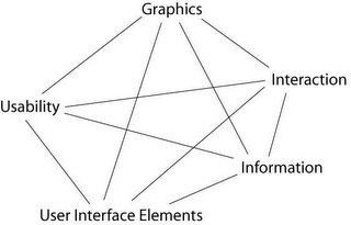
the User Experience...
Why do we enjoy a good ‘food’??? becoz it has a perfect blend of spices and ingredients. A good cook will tell you that it’s all out ‘just perfect’ mix of ingredients…so its all about knowing and realizing this perfect mix of things for GOOD USER EXPERIENCE in products…
The ingredients involve…
- Usability
- Graphic
- Interaction
- Information
- UI Elements
So as a cook (designer) your main aim is to mix them together to make a good dish (product) out of them…skipping one or not mixing one in proper proportions would spoil the taste (experience).

So a good UI would have a good composition…where neither of the above factors dominate but work in harmony with each other…
The graphics should not dominate the information, the UI elements should compliment interaction, the graphic changes with change in UI elements or Interaction, and usability results can changes with change in any of the parameters…so it’s all connected and it’s all a SYSTEM…
cont...
guess the idea quoted in the previous posting is not unique…it’s just that I realize a system exists…it will be a huge topic to debate and research…but if I have understood correctly Jesse James Garrett “Elements of User Experience” also in a way states these factors…though he believes its in layers while I believe they are equal and effect each other more strongly…
But someone in the field of UI may (I hope) accept my argument that these are related and I explain this with an example…
Let’s look at various perspectives…
Suppose we start with finding the commands required…and arrange in a logical sequence (information Design)…how many commands are required…which ones are more important >> how many commands we need to add will define the interaction…can all commands be presented to user… >> UI elements are decided by what function each command performs…where it is placed…either all buttons or drop down or mixed >> also the visuals…whether all are in one row or in multiple rows…what icons are required…how many and how to make them different from already existing ones but yet should look like a part of the family…does it starts to dominate the other commands >> Usability consideration would be…are all the icons understood by user…is the terminology of the command correct…are the buttons spaces correct…is the interaction or UI elements fit into the metaphor of existing tools/commands…
So the ‘Experience’ of using that tool bar would come as combined effort of all these factors and not one…if the icon is not properly understood then…even if it is beautifully designed will spoil the experience…or if it is usable but doesn’t look good then also the Experience will suffer…again if the information architecture is not perfect usability will suffer and even a good icon wouldn’t bring the experience…
If we find that there is not enough space for 8 commands, only 5 can be presented…then we have to either think of new interaction model or UI elements or change the information architecture…may be break the tool bar into 2…if they change the visual design would also change and hence the Usability experts again have to evaluate the new design…
This is huge topic to write…but I strongly believe a good design is one which takes care of if not all then MOST parameters…and that’s the key to USER EXPERIENCE…
I would appreciate if readers could mention their names while posting comments…
Thanks & cheers…
© Abhishek Kumar, 2005

0 Comments:
Post a Comment
<< Home